In the design world, Helvetica is like a white T-shirt. In the hands of a master, it’s a high-fashion statement. In the hands of the uninspired, it’s just something you threw on because you didn’t want to think.
Is it the perfume of the city, essential, invisible, and atmospheric, or have we simply become blind to it? There is a tension between the designer’s obsession and the client’s scepticism.

The Client Perspective: The Trust Gap
If presented to a client, we see a classic. They might perceive it as Default Settings.
- The Personality Gap: If a client asks for a brand that is quirky, hand-crafted, or disruptive, and you deliver Helvetica, the relationship hits a wall. To them, you haven’t found a unique voice; you’ve used a megaphone to whisper.
- The Default Feel: Because Helvetica is pre-installed on every Mac, there is a legitimate risk that a client thinks you just opened a Word document and started typing. If your kerning isn’t surgical and your layout isn’t inspired, it doesn’t look like Swiss Design; it looks like a lack of imagination.
- The Sterility Trap: Helvetica was designed to be neutral, but neutral can easily be misread as soulless. If a brand needs to feel warm, human, or empathetic, Helvetica can come across as emotionally detached—the typographic equivalent of a cold, sterile hospital wing.
The Designer’s Defence: More Than a Font
Why do we keep coming back? Because Helvetica isn’t just a typeface; it’s structure.
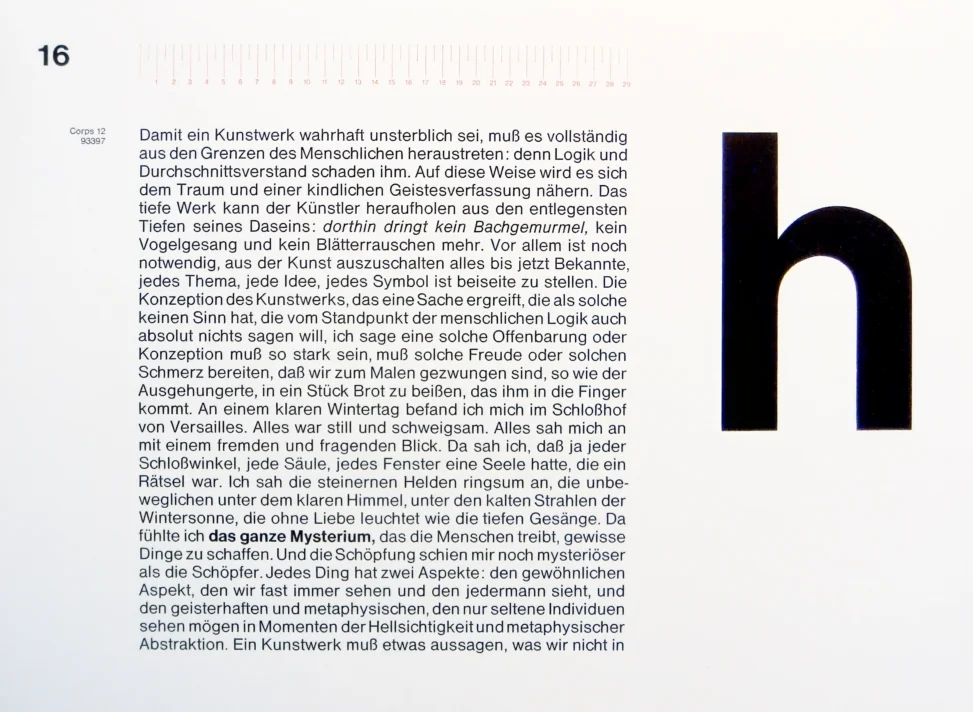
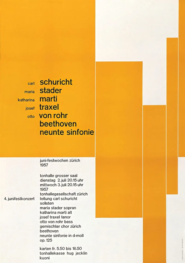
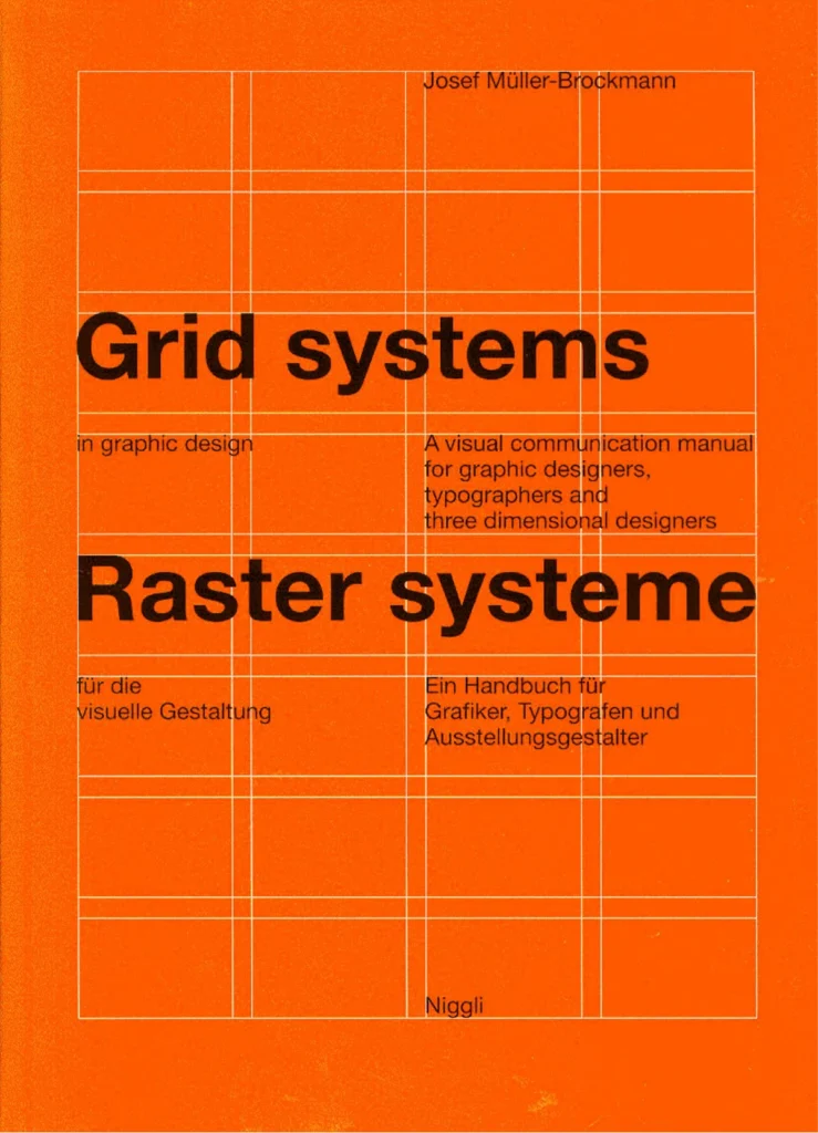
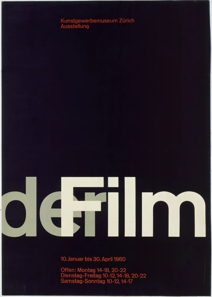
The Visual Silence. It allows for a level of clarity that other fonts clutter. In a world of loud, ‘look-at-me’ design, Helvetica provides the structural addition that sets the pace and organisation of a layout. It’s the invisible grid made visible.
When used, we aren’t just picking a font; we are managing Proportion. We are deciding that the message is more important than the medium. It is the air of the design, you only notice it when it’s gone or when it’s polluted.
To understand its power, you have to understand its origins. It wasn’t born Helvetica.
A Brief History of the Global Standard

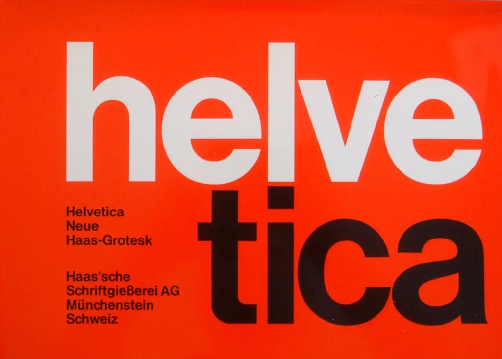
- 1956: Max Miedinger and Eduard Hoffmann designed it for the Haas Foundry in Switzerland. Its original name was the much more literal Neue Haas Grotesk.
- 1960: Stempel (Haas’s parent company) realised Neue Haas Grotesk was a bit of a mouthful for the international market. They renamed it Helvetica, derived from Helvetia, the Latin name for Switzerland.
- The Digital Conquest: Its fate as a global titan was sealed in the 70s and 80s. Linotype licensed it out to major companies.

When you use it, you are leaning on decades of mathematical perfection and industrial history. Just remember: if you’re going to use the most famous font in the world, your layout better be the most interesting thing in the room.
Lazy or Cool?
Helvetica is only lazy if it’s used to avoid a decision. It’s cool when it is used to enforce one.
It is widely considered the most famous and influential font in the world