Sometimes we create hypothetical covers driven by our own aesthetic, which can be cathartic yet challenging because the work feels pointless. This reflects the difference in mindset between fine art and design.
These clientless exercises, though, help alleviate the frustration when clients pull a designer in different directions, leaving the original design as merely a husk of its initial concept. Including just the title and author is, of course, a luxury, but then this particular design exists only as an exercise rather than a saleable product. I wonder if readers actually read the usual clutter of sales-oriented text on a cover. Realistically, though, anything that draws a reader in from the vast sea of competing titles is valuable. From a personal book-buying experience, I tend to purchase based on parallels and, of course, the design’s look and feel.
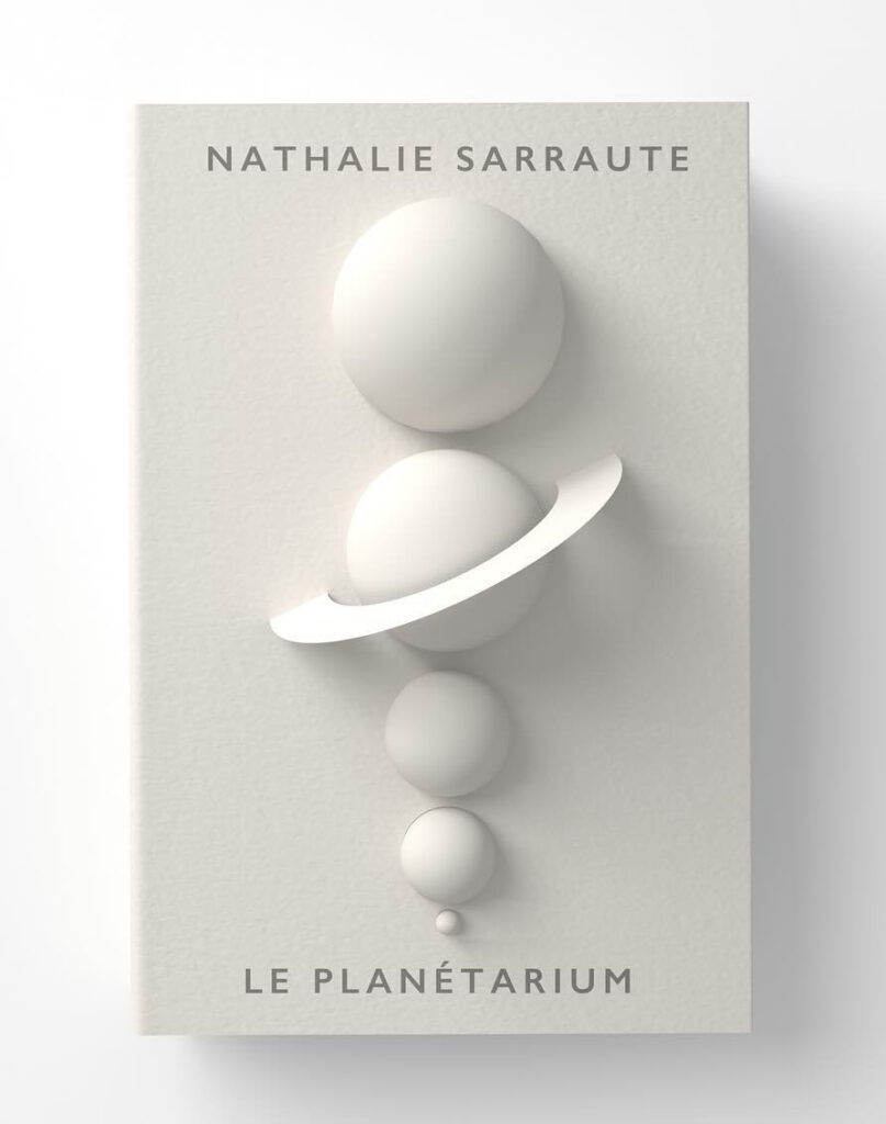
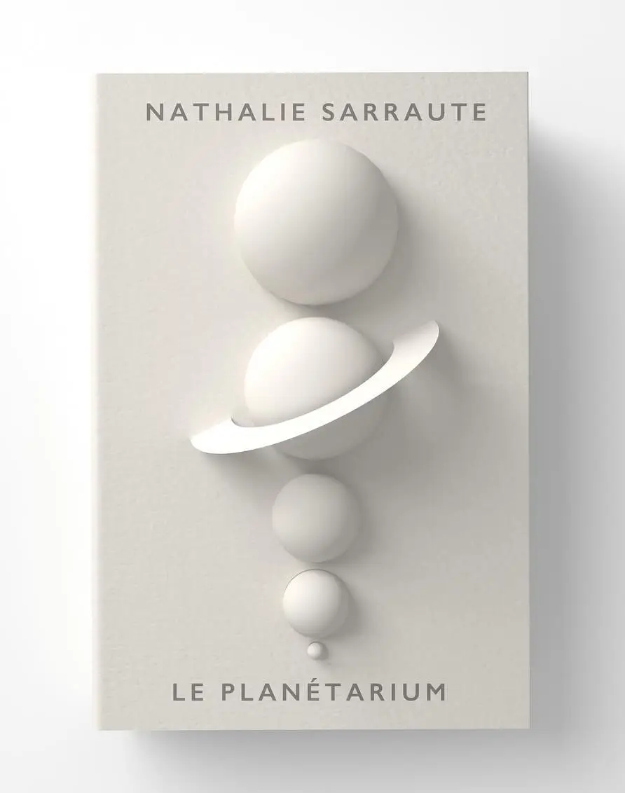
We developed a 3D model that maps out the planets in our solar system, meticulously arranging them according to their actual physical size. To give the model a unique and warm aesthetic, we applied a custom texture map that evokes the rustic quality of rough, handmade paper. This distinctive rendering transforms the cold geometry of the planets into something tangible and inviting. Finally, we incorporated a simple, clean typeface that complements the earthy texture and keeps the focus squarely on the striking visual hierarchy of the planetary sizes.