Signage defines the visual language of the American highway. For this project, I set out to capture that specific, utilitarian aesthetic. My goal was to build a fully realised 3D alphabet based on the portable, movable message boards found on roadsides across the US.
I wanted to move beyond simple 2D typography and create a system that felt tactile, heavy, and mechanically functional.
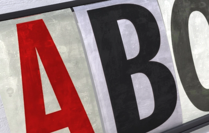
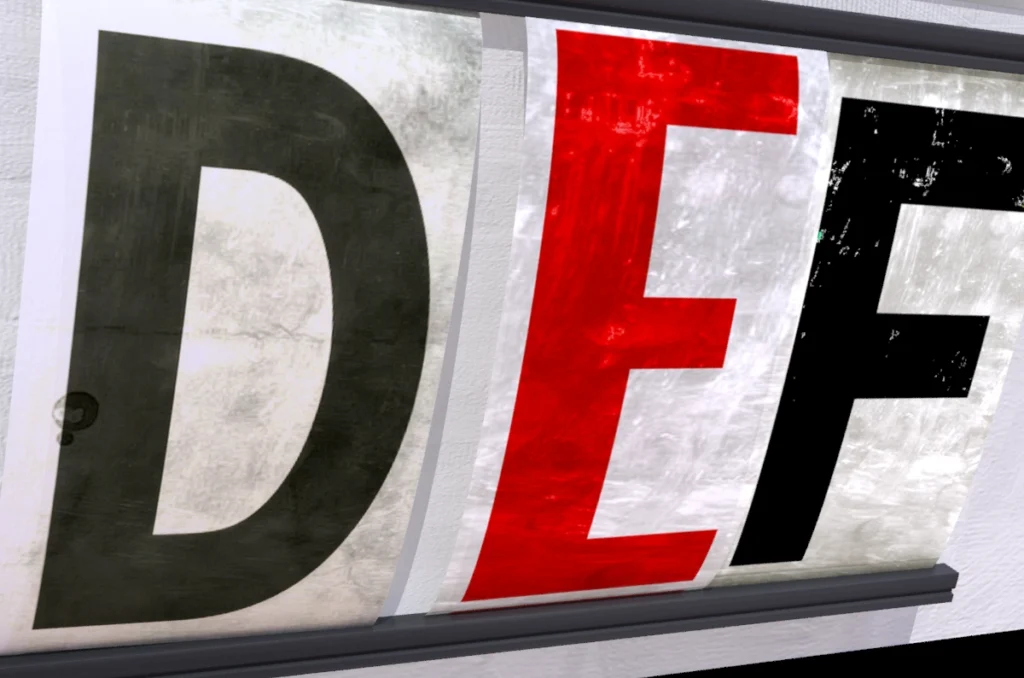
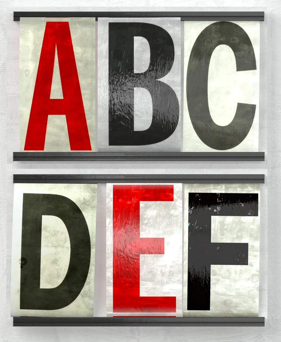
We began the design process by analysing how these physical letters actually work. They are not rigid, flat planes; they are flexible sheets of plastic that bend under tension.
To replicate this, I modeled the “bowed” structure directly into the mesh. I gave each letter a subtle outward curve to mimic the tension of acetate squeezed between tracks. To further ground the design in reality, I modeled the gripping rails at the top and bottom. This adds essential depth and shadow, visually locking the characters into the background rather than letting them float in space.

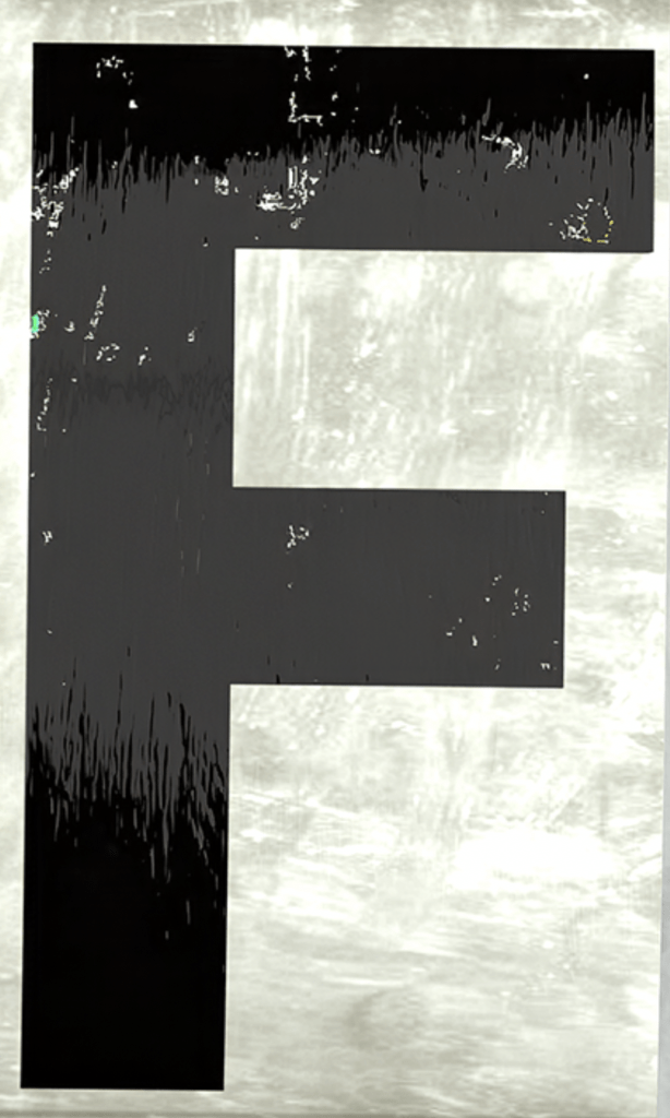
To achieve photorealism, I focused intensely on the surface imperfections. These letters spend their lives outside, exposed to UV rays, exhaust fumes, and road debris.
I developed a series of custom wrapping textures to simulate this wear and tear. I aggressively distressed the maps, painting in scratches, scuff marks, and sun-bleached gradients. By wrapping these grunge textures around the bowed geometry, I ensured the dirt collected in the crevices and the highlights hit the curves correctly, selling the illusion of weathered, industrial plastic.