
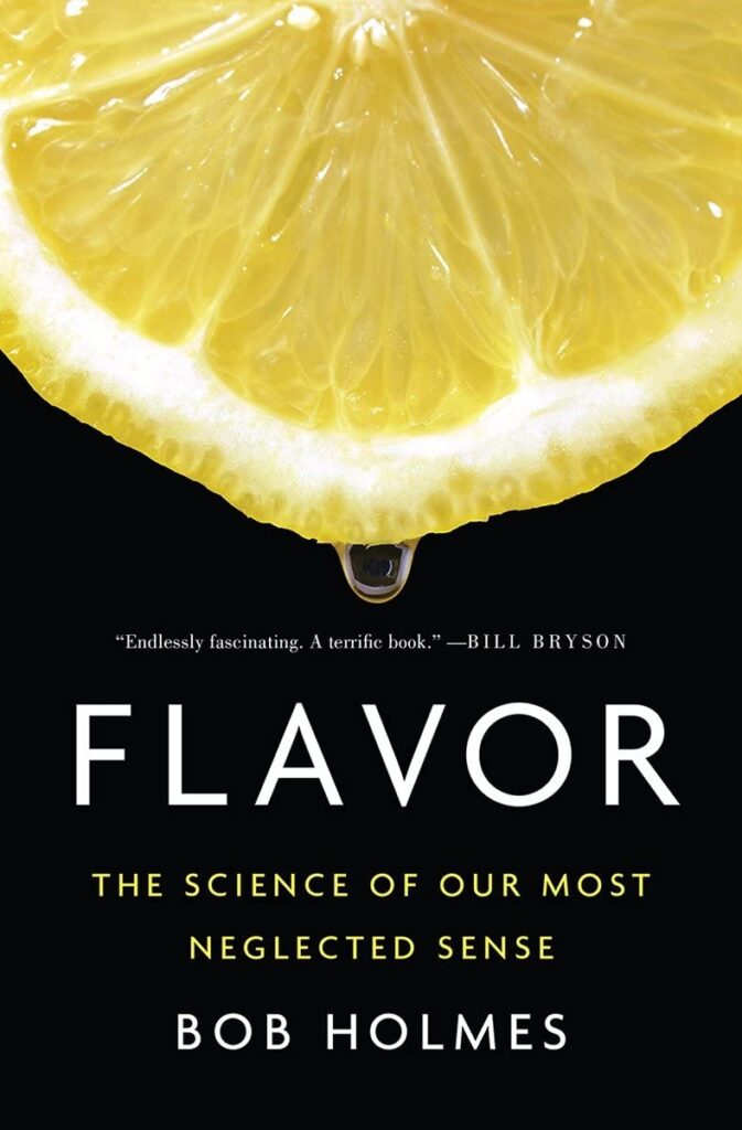
Two Associates were asked to are configure a US cover for the UK market. Here is the US original cover published by WW Norton
Here is our re-configured UK version, redesigned from the US edition 2017
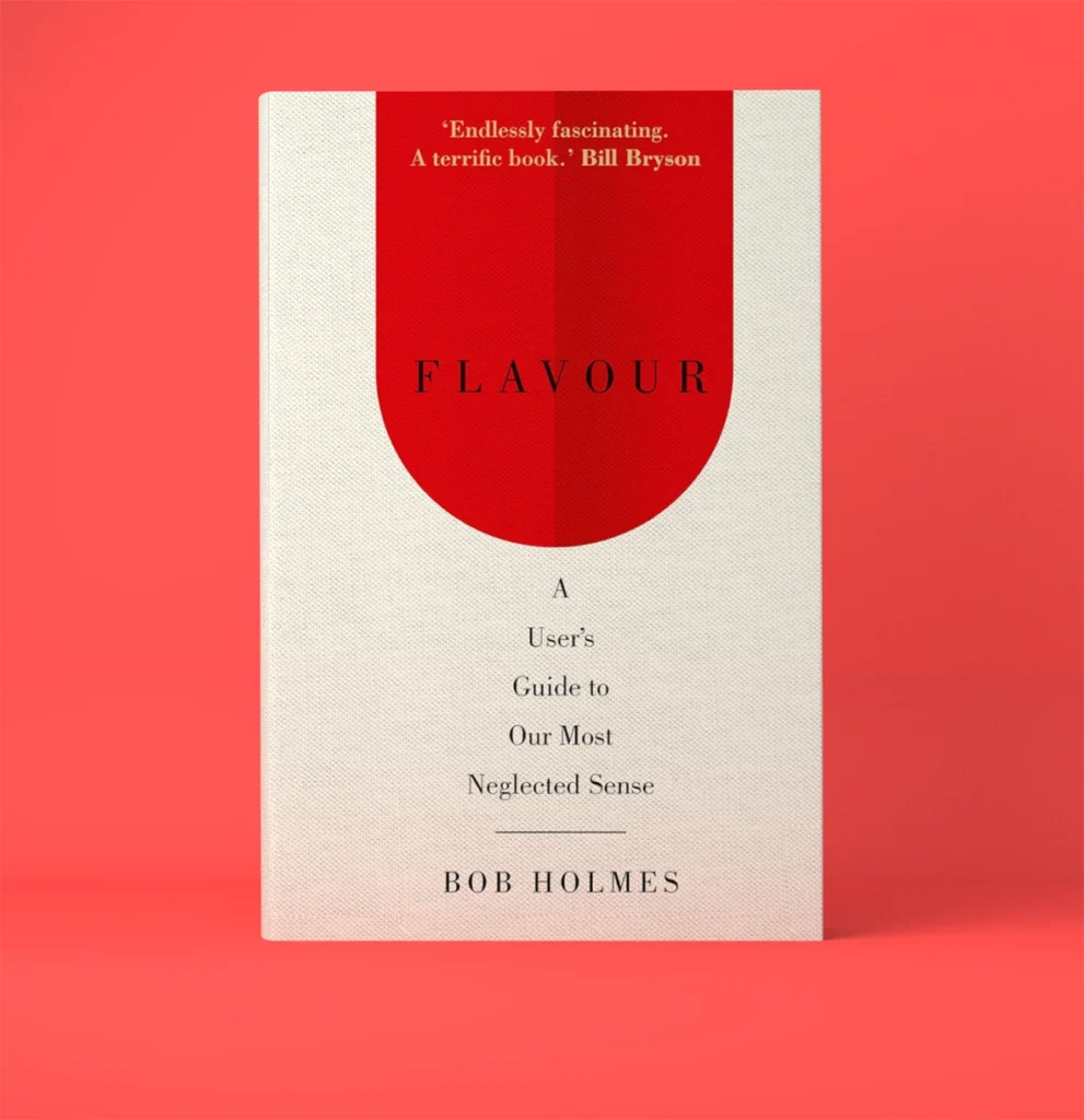
The difference between the two approaches is interesting. The US version of the book is designed in such a way that it elicits an immediate reaction from the reader due to its visualisation of a specific flavour. However, some may feel that the black background used in the design is a little too strong. On the other hand, the version we created might have been too simplistic for such a complex concept. Looking back, we could have incorporated some more elements to make it more engaging and thought-provoking.
Unfortunately, the book is no longer available in print except for an e-book, which is a pity. With the rise of digital reading, it’s understandable that publishers are shifting their focus to e-books as their backlist.