
Error of Judgment by Chris Mullin lit a fire under the establishment when it was first published. Shattering the prosecution’s case against six Irishmen charged with the Birmingham Bombings and going on to change the course of British legal history.
Designing Error of Judgement
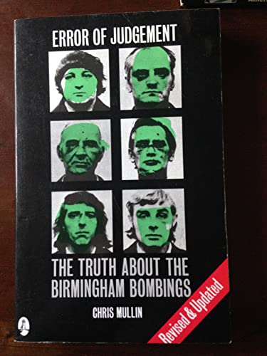
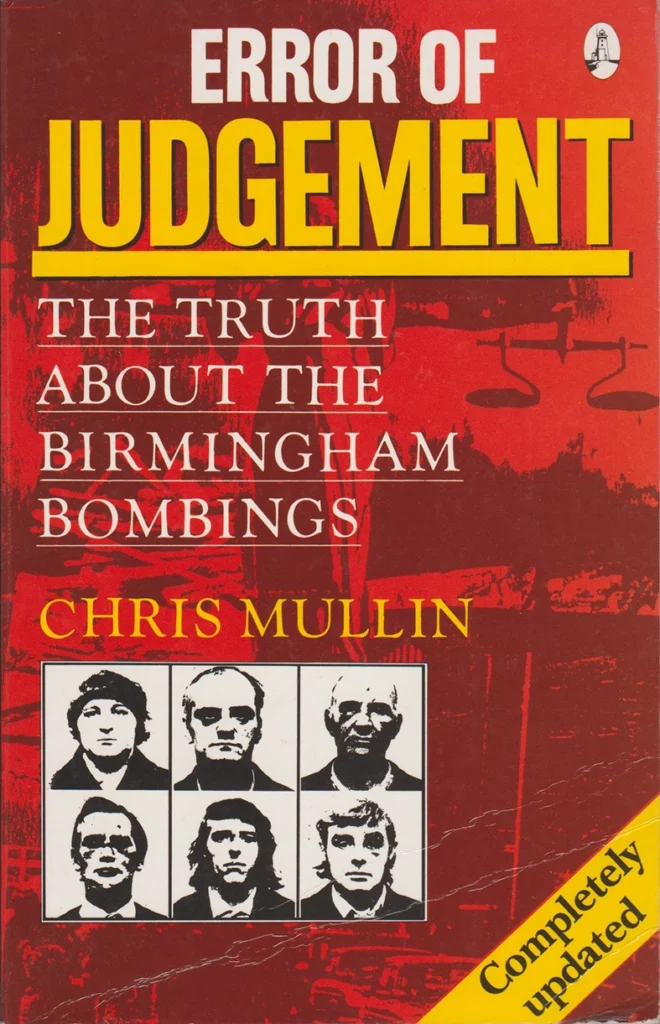
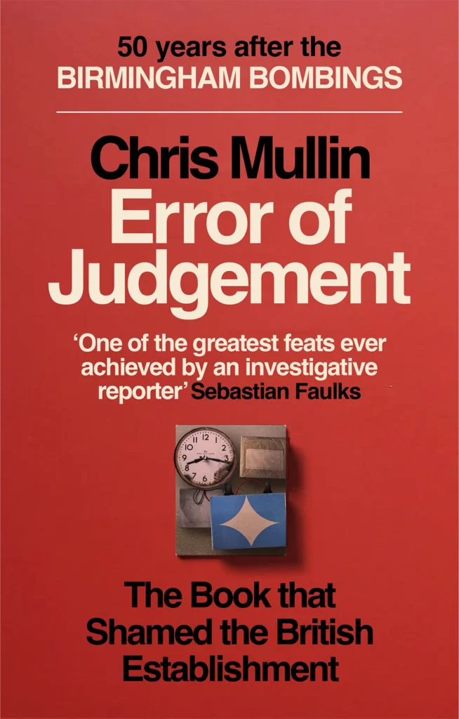
We were commissioned to redesign the cover for this classic text. The brief was to appeal to a new set of readers. Here are some previous editions with different covers:

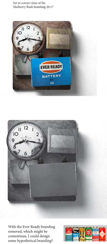
Our original intent was to create a 1970’s red top type of newspaper cover with a bomb image constructed to look as if was made in that era:

of the 1970s
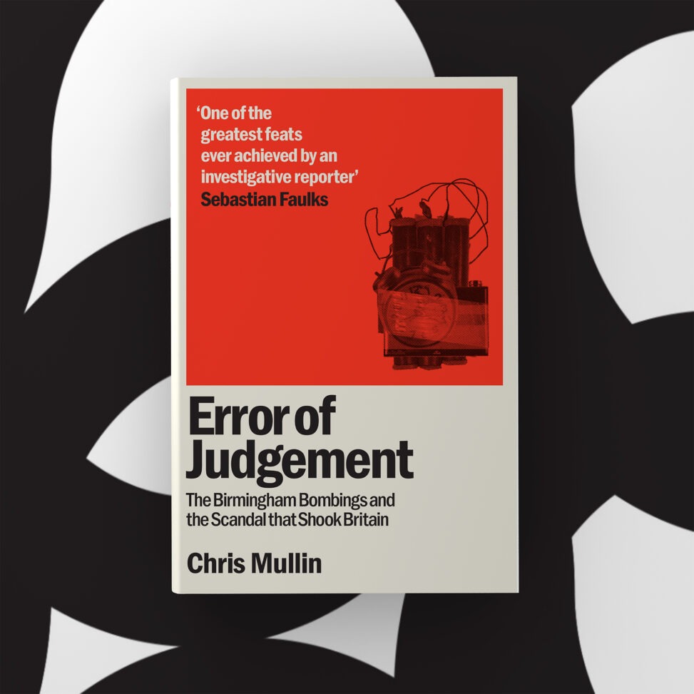
Mutually it was decided to simplify the design into a cleaner typographic cover. We formulated an approach that didn’t show the accused ‘Six’ but to illustrate the bombing symbolically. We created diffrerentimages of an IRA bomb. The main problem with the early designs was the amount of information that we had to include on the first proposals. Five separate parts plus the image.
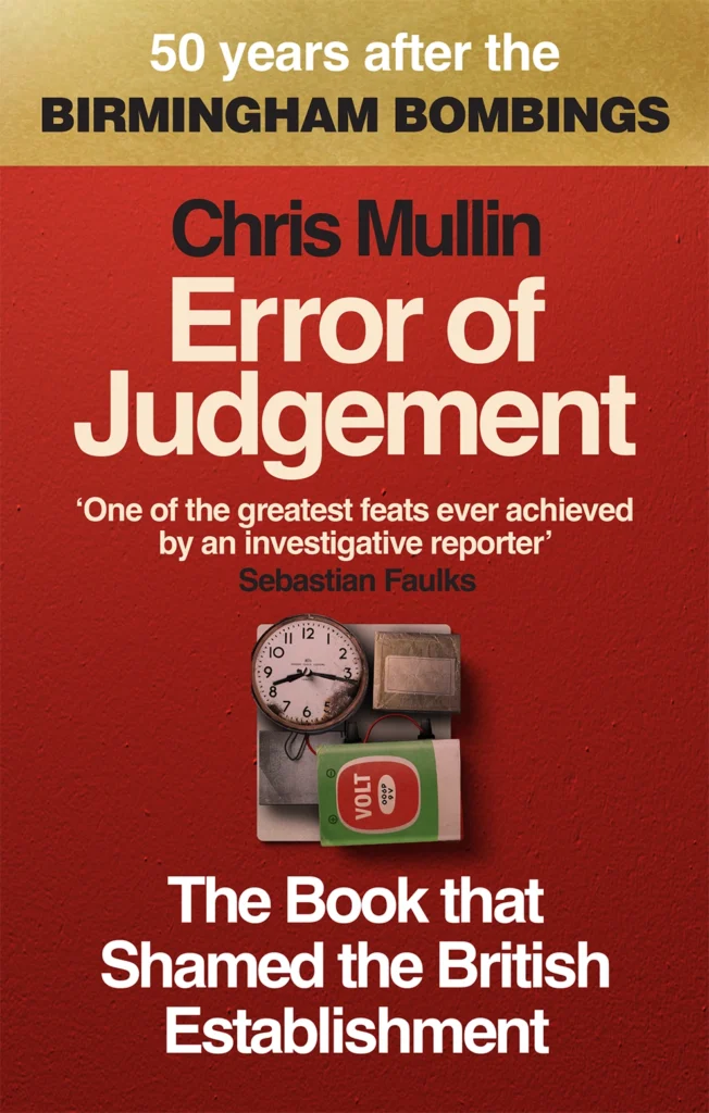
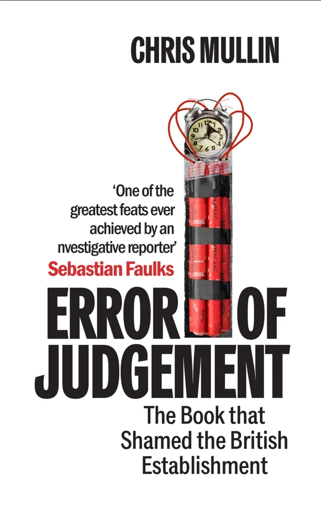
After pinpointing that the number of words to be included was making the cover look too cluttered. A new set of cover copy was produced, which made it easier to work with, mainly losing the ’50 Years after the Birmingham Bombings’, which was taking up a large amount of the cover’s real estate. We were able to make more of the Sebastian Faulks quote.
This placed the book on Amazon and on the bookshelf in a better way.
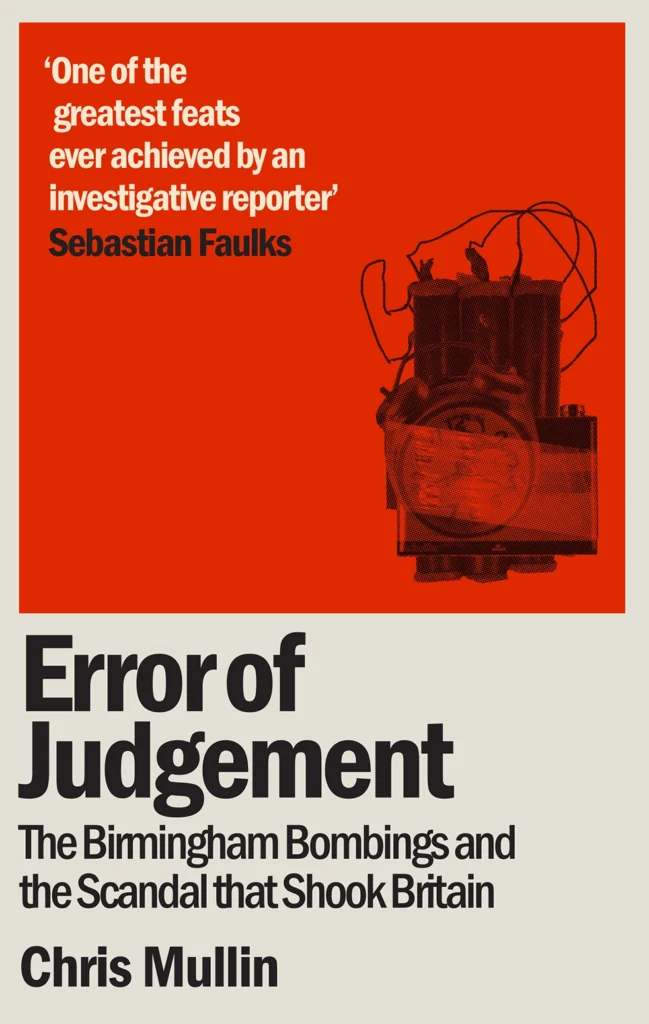
Making the bomb image abstract drew less focus and allowed the type to be clearer. Also, separating the image from the text by having a panel for each part, type in one colourway and the information in red.